|
Things to Consider for Your Revisions
Revise User Docs for Final Portfolio
To help guide your revisions, I wanted to give you a few things to consider. Let's discuss these, and please ask questions. To quote a former professor of mine, "Any questions...today's a good day to ask."
- Put text for steps ABOVE the image
- There is some debate about this, but having text below an image in procedures doesn't go in a logical, as in, sequential order.
- Readers need to be oriented to do something, so the text tells them first, and then the screen shot or image shows them.
- Readers will already be drawn to the image over the text, so having the text first lets the users know what they're about to do.
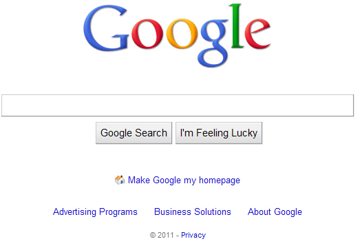
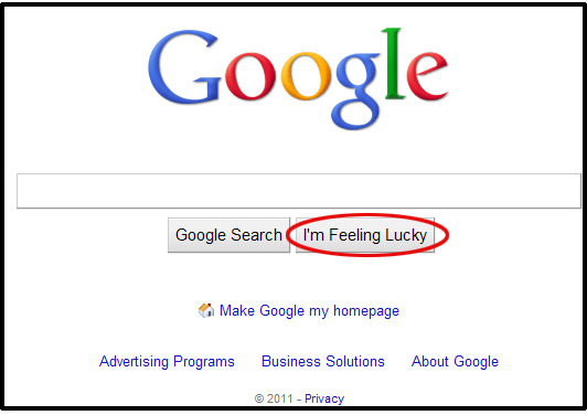
- Figure X and captions (e.g., Figure 1: Google Hompage)
- Now, these, of course, go below extratextual elements.
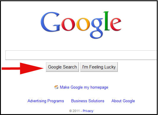
- Circles, arrows, and callouts
- Try using circles or boxes {Let me show you how}
- Arrows are quite cheesey and 1990s looking
- Legends work well
- "Results may very"--search results change
- Set certain text, such as URLs, commands, buttons, and menus, apart from instructional text using quotation marks, highlighting, bolding, underlining, etc.
- Step Text: Open up a browser and go to www.google.com and type in the search paramter ABBAs Agnetha Faltskog Is Open To A Reunion and click I'm Feeling Lucky
- Revision:
*Open up a browser and go to www.google.com
*Type "ABBA’s Agnetha Faltskog Is Open To A Reunion"
*Click I'm Feeling Lucky
--or--
*Click 
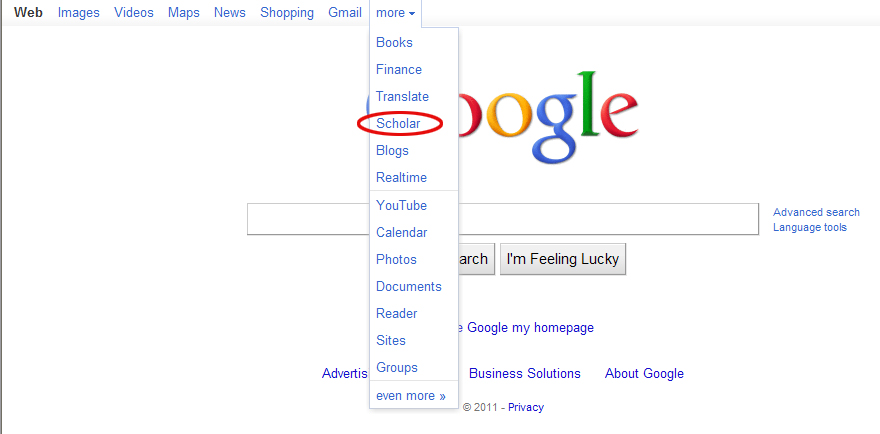
- Show how to refine searches to expand your user documents
- Get right to the search then discuss alternatives
- Give commands
- Don't tell the user "If you want to..."; tell them to do it!
- Also, don't feel as if you have to put down a phrase like "the following screen will appear" for each step a user performs
- Be realistic about where, how, or if these will be used, and tell me that in your meta-analysis persona document in the section on "User Approach"
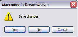
- Use screen shots
- Clear, good-sized screen shots
- Entire screen captures aren't effective
- Personas (Cooper pp. 142-147)
- Discuss technological literacy instead of motive to use the specific document--motive descriptions are what I call scenarios
- Consider persona patience and how to reflect that (e.g., can't sit for more than 5 sec. at a red light before blood pressure goes up)
- How about discussing hobbies? (e.g., what my a video gaming pasttime tell us about the persona)
- Have pictures of your personas
- Be more efficient (we'll come back to this)
- Where are your user test questions? {Fix that for you final portfolio}
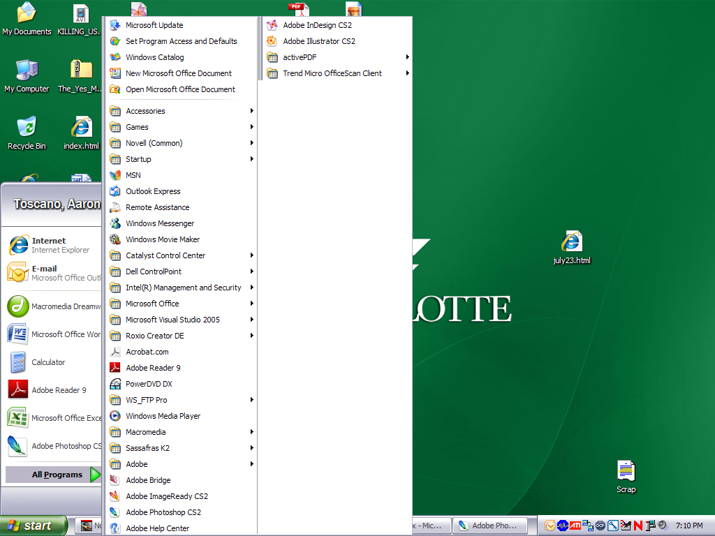
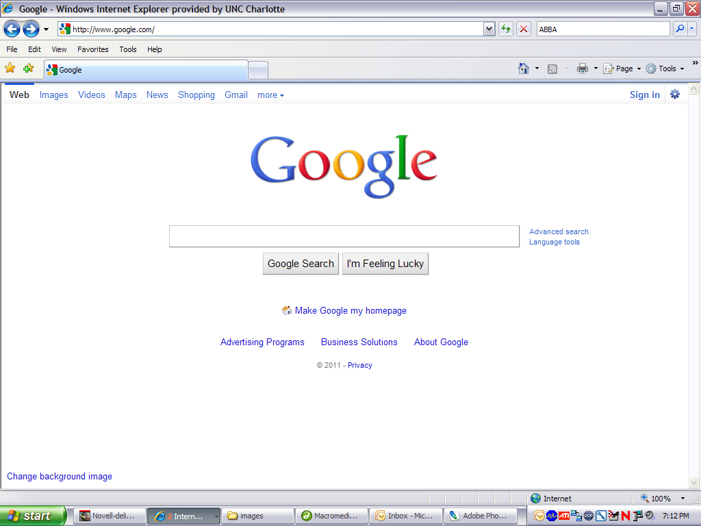
A Note on Screen Captures
It is practically never effective to use an entire screen capture in a document. Instead, use a cropped one or capture an active window (e.g., a dialog box). Take a look at the following screen captures, and consider how effective or ineffective they are.
|