Peer Review 2 || Elijah Joseph
Summary
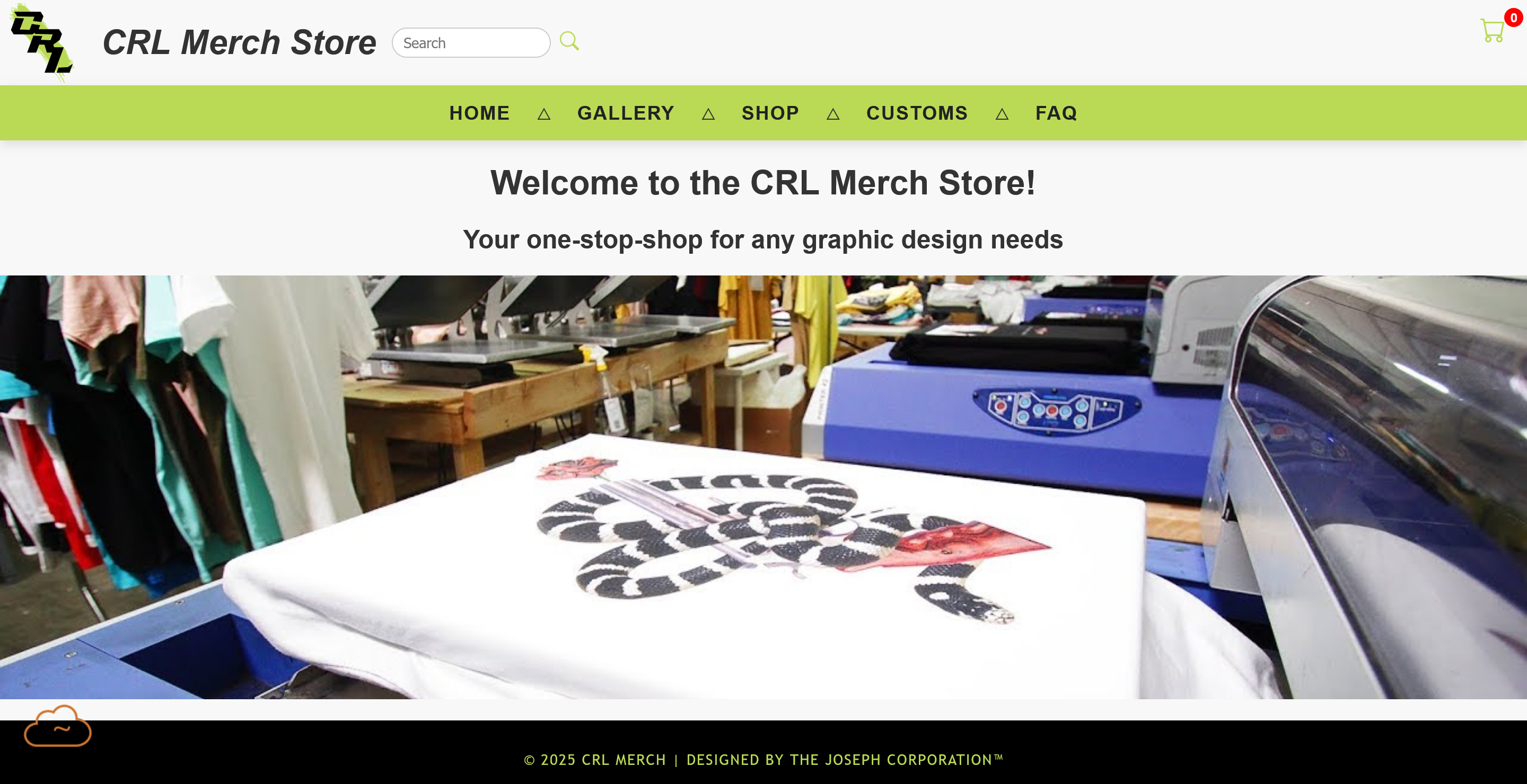
The site looks great and has consistent and great readability. The use of green is used perfectly and helps add color to the page without being overwhelming.
Requirement Checklist
- Leads to page to be reviewed
- No spaces/uppercases in names
- Design:
- There is sufficient contrast on the page. Darker text with a lighter background and heading color stands out from page.
- Page uses site colors and fonts with standard .css file
- CRAP:
- Contrast: There is a strong color contrast between elements, the light background and dark text make reading easier. The header also includes a green background that stands out clearly from the rest of the page.
- Repetition: There is consistent font, text and color across all pages. The heading and footer remain consistent when navigating through pages.
- Alignment: The center alignment of text is maintained well and images and text are aligned properly within sections.
- Proximity: Headings and descriptions are placed closer together to show they contain related information. Other elements like products and photos within the gallery use consistent spacing between keeping the page from being cluttered.
- The page has a header, main, footer and a nav between header and main.
- The header does have text in h1
- There is no page name in the header.
- There is a difference between the head, header and heading.
- The main starts with name of pafe as H2 and does have the site name included but in reference to and not as page name.
- The footer is included on the page.