Peer Review 1 - Hunter Beachum
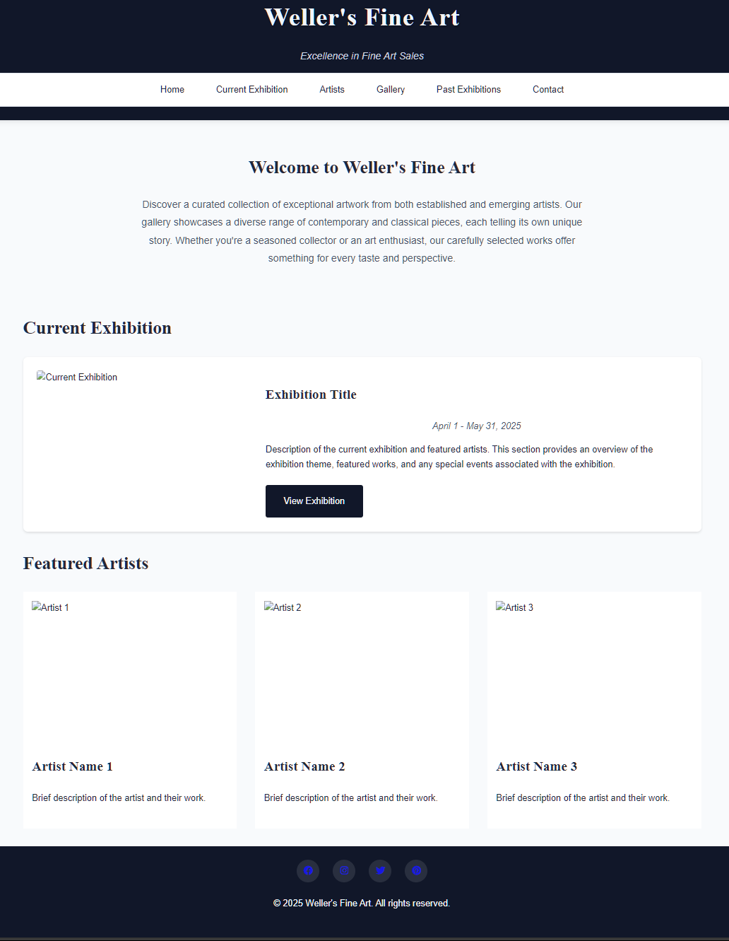
- ✅ Submission leads directly to the correct page.
- ✅ No spaces or uppercase letters in file/folder names.
- ✅ Contrast and font sizes are readable and accessible.
- ✅ Standard stylesheet is used effectively with clear visual design.
- ✅ CRAP principles observed:
- Contrast: Effective use of background and text colors.
- Repetition: Consistent layout and styling throughout the pages.
- Alignment: Clean and grid-aligned sections.
- Proximity: Grouping of related items is well-done.
- ✅ Includes header, main, and footer structure.
- ✅ Optional nav between header and main is present.
- ✅ Brand header with text in an h1 is present.
- ✅ Header includes brand name and not the page title.
- ✅ Main begins with an h2 containing the page name, not the site/brand.
- ✅ Brand tagline is consistent: “Excellence in Fine Art Sales.”
- ✅ Footer includes:
- Menu for site pages in nav element.
- “Designed by Hunter Beachum” is present.
- HTML validation button present and functional.
- CSS validation button present and functional.
- ✅ Assignment-specific content is included (project-based site).
💡 Suggestions:
- Maybe add subtle hover effects to links for better interactivity.
- Include more alt text descriptions for accessibility.
Email sent to: hbeachu2@uncc.edu
Reviewed by Jayden Vargas – April 27, 2025