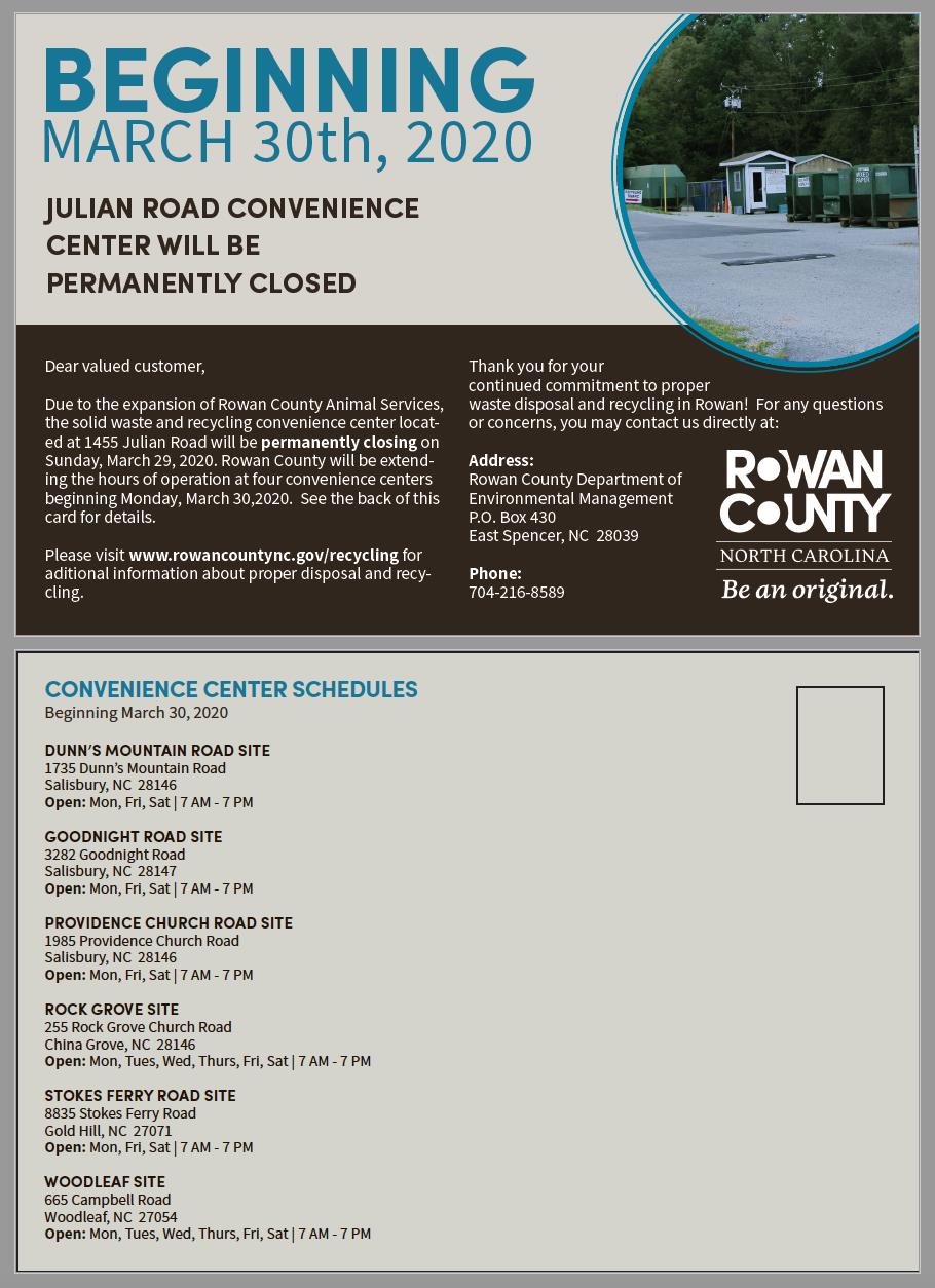
Julian Rd. Postcard, made in Adobe Illustrator, 910 x 1254px, 2020
I was asked in my internship to create a postcard notice to be sent out to Rowan County’s citizens concerning a convenience center closing. Working within a specific color palette and including all required information and graphics, resulted in a successful, easy-to-read design.