|
(section 091)
October 20th: Typography
Type fever, type fever
We know how to do it
(da-da-dun, da-da-dun, da-da-dun)
Gimme that type fever, type fever
We know how to show it
(So let's show it!)
Announcements
- Society for Technical Communication (STC)
Charlotte Regional Chapter Meeting
Tues., 10/26 @ 6:30 pm - 8:00 pm
Friday Bldg. 008
- Southeast Women's Studies Association Annual Meeting
Submission Deadline: Mon., 11/01 (250-word abstract)
Conference: March 24-26, 2011
Georgia State University, Atlanta, GA
- Annual Meeting of the Popular Culture and American Culture Associations, Southwest/Texas Region
Submission Deadline: Wed., 12/15 (250-word abstract)
Conference: April 20-23, 2011
Marriott Rivercenter San Antonio, TX
- UFC 121 Sat., 10/23 @ 10:00 pm
Plan for the Day
We've got a few things to do today, so below is a list:
Ethos, Pathos, Logo
Type is probably more of an appeal of ethos, but type may also evoke emotions. Yes, ethos and pathos aren't either-or when it comes to design. Elements of a design may relate to both. But you need to recognize (and explain) their boundaries. I'm pretty confident there is no appeal of logos in typography.
- Ethos:
appeal or presentation of one's character or credibility; characterization
- Pathos:
appeal to emotions; evoking emotional responses
Some other definitions to consider when distinguishing between ethos, pathos, and logos:
Ethos
- character: an assumption of one's moral or ethical nature--good, bad, ugly.
- credibility: an assumption that an individual or group is fair minded, believeable, trustworthy.
- characterize: marking an individual, organization, idea, situation, or text (e.g., document) with specific attributes or characteristics.
- For instance, how might you characterize the latest Jackass movie?
- juvenile
- immaturity
- gross-out humor
- extreme stunts
- look and feel: this is an idiomatic expression we use in American English to refer to the qualities, attributes, characteristics, and textures of an item, person, or text.
- Feel in this phrasing has NOTHING to do with a speaker or document trying to evoke an emotional responses of an audience.
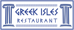
Why does the following have a look and feel of a Greek restaurant?
Pathos
- emotion: sadness, anger, happiness, joy, celebration, etc.
- affect: response to emotional stimuli.
- feeling: can refer to emotions but is also used for senses like touch, which has NOTHING to do with a speaker or document trying to evoke an emotional responses of an audience.
Additionally, we sometimes claim "I feel like this is a well-designed proposal," which doesn't imply an emotion--it's an assumption or perspective. An assumption, belief, attitude, or opinion is not the same as an emotion. You might "feel" someone is credible or not, but that has NOTHING to do with a speaker or document trying to evoke emotional responses from an audience.
However, one could make an argument that "I feel like you don't talk to me enough," represents an attempt to make the listener consider the feelings--emotions--of the speaker, which elicites an emotional response from the listener. That is for the psychologists to figure out. I seriously doubt this will ever be of concern for you in document design. Your personal life, however, might be full of it.
Logos
- logic: as in a formal study and not an audience's interpretation of what's "logical"
- argument: reason behind supporting a position through evidence or formal logic (as in syllogism)
- facts: evidence claimed to, assumed to, or known to be true
- statistics: collection, interpretation, and organization of data; often numerical or chart-based representations
Please consider the above elements when doing your assignments and use the terms in your discussions and memos.
Also, unless the book (p. ) and wikipedia are mistaken (hardly a chance at that), typefaces are not subject to copyright. Check out "Types of Typefaces" section on the page.
Chapter 6: Type
I know you use fonts daily, but do you ever stop to think about what they convey? This chapter is pretty detailed about how to incorporate typefaces into your designs and even covers how to think about what typefaces convey. There is quite a bit of vocabulary that you'll want to know. Let's go over the highlights of the chapter, but do know the following terms below:
- boumas (p. 153)
- Characteristics of letter forms (pp. 159-162)
- Serif vs. Sans Serif (p. 163)
- Eye direction and perception
- Serif creates a line (p. 160)
- Sans serif's vertical look (p. 163)
- roman vs. italic (pp. 163-164)
- Monospace vs. proportional
- Leading (p. 173)
- Kerning (p. 176)
- Justification (pp. 177-180)
- Quotation marks and primes (p. 182)
- Antialiasing (p. 194): reduces distortion when an originally high resolution image (or sound) is displayed (or played) at a lower resolution.
Describing Fonts (What rule/s am I breaking?)
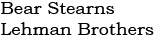
The following font is "professional" because it has a no frills look that calls out longevity and stability. The typeface is Bookman Old Style. It's rather "stately" looking and evokes an ethos of conservative, prudent business.
The above fonts conform to a busines or law firm look that has no desire to be seen as goofy or childish like this font called Ravie:
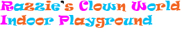
The above font evokes a very "clown-like" ethos with the colors and wavy apearence. Also, if you think your font looks like candy, it's probably a sign (semiotics anyone?) that you should use it for kids and not professional, white-collar businesses.
What does the following font suggest?

These fonts were created in Photoshop and saved as .jpgs--they aren't cheesey Word Art. Put your cursor over the font image to see the typeface name.
Perception, Culture, and Rhetoric
(possibly save for next week)
Last week I asked you to have a typeface that you'd be able to explain. With a partner (no more than 3), create a new webpage that displays or, at least, links to your typefaces and explain what the typefaces convey. Do your best not to conflate ethos and pathos. We've talked quite a bit about ethos and typefaces because it seems to be more common. But I'm sure we can find typefaces with emotional appeals.
All partners should link to this new page you create.
Chapters 9, 10, and 11 (save for next week)
Try your best to use these terms when you describe your assignments (in memos and reflections). Of course, when I say use, I really mean know them and use them properly. The following come from Robin Williams' book (p. 145):
- Concord--typefaces have little or no variety within a document; elements are of the same family.
Not to be confused with Concord, NC.
- Conflicting--typefaces are similar (but not the same), and that similarity is what's distracting; such type looks like a mistake.
- Contrasting--typefaces that are moderately to dramatically different.
When you use the above terms, make sure you explain why typefaces are concordant or contrasting and why you chose conflicting typefaces...why you broke the rules.
Categories of Type
We mostly think of (at least in my design classes and research) two types of fonts and sometimes a third--serif, sans serif, and script. Of course, artsy, crunchy Robin Williams has to have six types. Well, she is the design guru. What do the following category types say? In other words, when might you use them? In even other words, desribe their perceptual, cultural, and rhetorical effects.
Oldstyle
Modern
Slab Serif
Sans Serif
Script
 Decorative Decorative
Hey, at least we have choices. But why?
Workshop for Document #3: Tutorial
Your tutorial assignment is due next week (10/27), so make sure you have something to show to another classmate tonight. I'm giving you lot's of time tonight to workshop. Check out the updated assignment page for more details. Remember, you have a choice to do a tutorial or an explanantion of a science or technology.
The 100-word commentaries will be turned in next week with your assignment; therefore, you should give your comments to the person you're reviewing via e-mail tonight.
Next Week
Document #3 is due next week (10/27). Make sure you read Chapters 9, 10, & 11 in The Non-Designer's Design Book.
... |