(Un) Ethical Visuals
Spring 2008
Distortion
When do visuals lie? What should you do to make sure you’re accurately representing the facts in a visual?
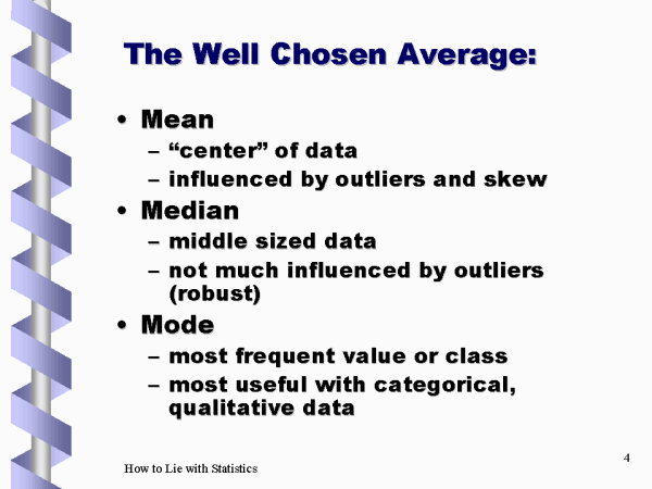
· Averages: mean, median, mode
· Pictorial representations
· Decimals
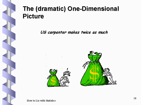
What’s going on in the chart below? Does it represent twice as much?
More on Misleading
Statistics
Let’s check out this PowerPoint presentation about misleading graphs.
That PowerPoint had an alternative definition for primary colors. It should have just mentioned that using cheerful, light colors implies a cheerful, positive message.
Check out this description of Primary Colors. Notice anything odd?