GeoDesign
Tutorial 7 - Creating Map Layouts
Objectives:
- Create a map using the ArcMap Layout interface
- Add various elements to the map layout
- Learn how to incorporate results into maps
Reference: This tutorial was originally developed by Phil Hurvitz in 2007. Phil is currently a Research Assistant Professor at the University of Washington. The tutorial has been modified to better work with the new ArcGIS 10.2 work environment.
Load data into an ArcMap document
Data can be found within the zip file ex7 by clicking HERE. Create a new folder on the Desktop. Name the folder mymap, extract the following personal geodatabase here in the folder.
Files:
- map_display_data.mdb : there are three feature classes (roads, streams, and stands) and one raster grid (dem) in the geodatabase
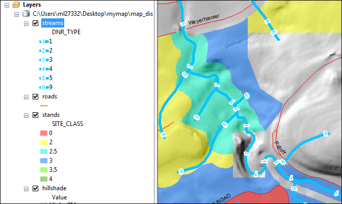
Open ArcMap. Create a new blank ArcMap document. Add the feature classes roads, streams, and stands from the geodatabase map_display_data to the map document.
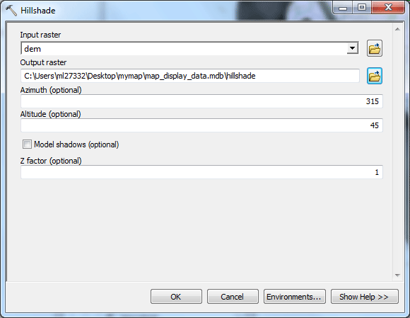
For visualizing the landform, create an analytically hillshaded landform model grid from the dem raster. Add the dem raster data source to the map.
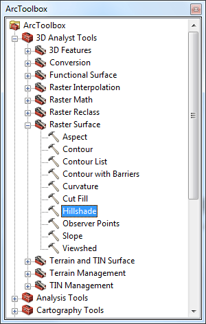
Make sure the Spatial Analyst Extension is on (Customize > Extensions > Spatial Analyst). To create the hillshade model, open ArcToolbox  select Spatial Analyst Tools > Surface > Hillshade. select Spatial Analyst Tools > Surface > Hillshade.
Set the input raster dem, name the output raster hillshade and save it in the geodatabase as a raster dataset.
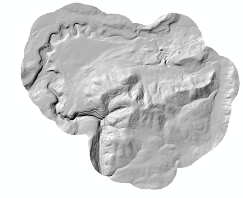
Remove the dem raster layer from the map. Turn off all the layers except hillshade,
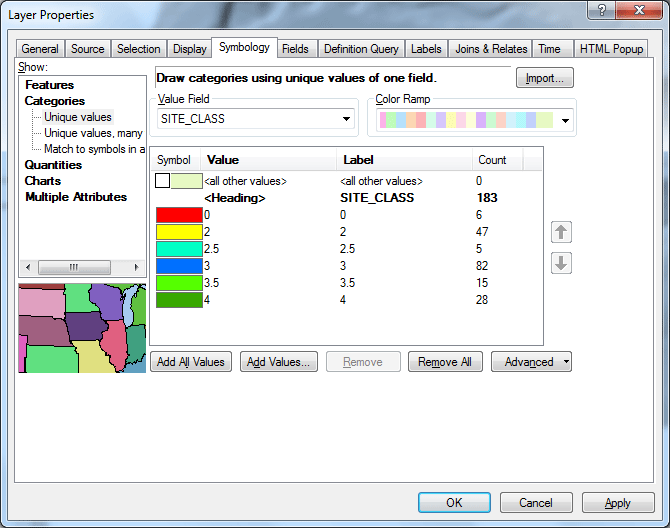
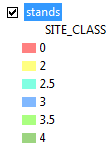
Now let's change the polygon symbology for the stands layer. Double-click on stands and go to the Symbology tab in the Layer Properties.
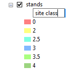
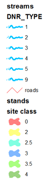
Use Categories > Unique values to display the different site classes. Select SITE_CLASS from the Value Field pick list . (Site class is a metric that describes the general quality of a location for growing trees)
To display the values in this field, click Add All Values. Double-click on a symbol in order to change the color. Change the color for each value as shown below. Define colors that indicate a change in intensity over the range of values. For the top symbol with the label <all other values>, uncheck the checkbox.
Click Symbol and select Properties for All Symbols.
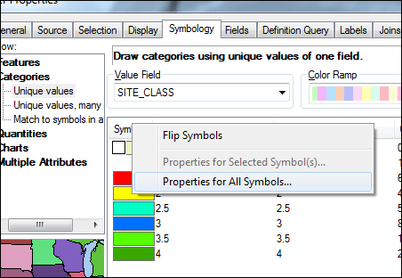
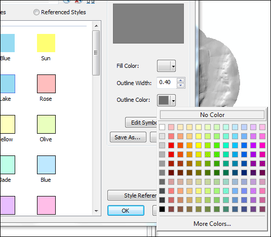
Click the Outline Color (and ONLY outline color!) box and change to No Color. This will show the polygons as solid fills with no borders.
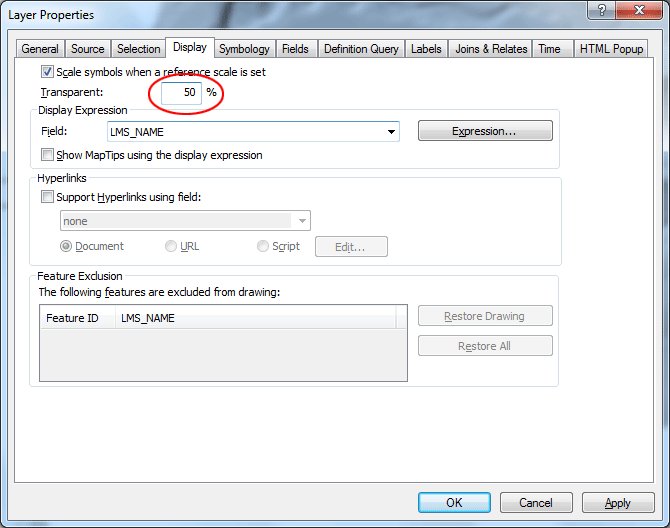
Click the tab for Display properties and set the layer's transparency to 50%. This will allow the hillshading to show through the forest stands. Click OK.
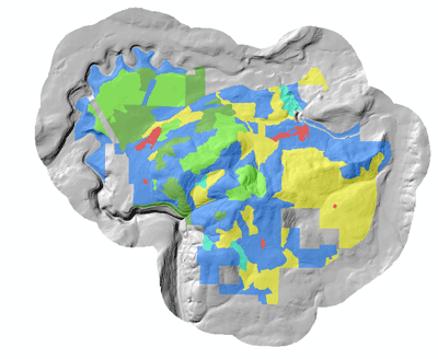
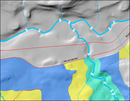
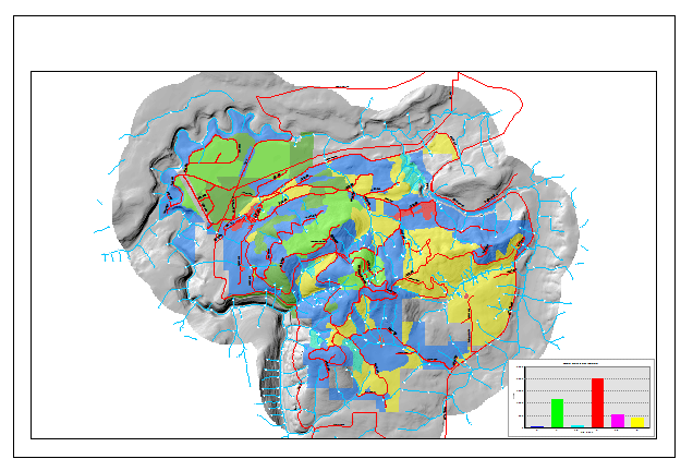
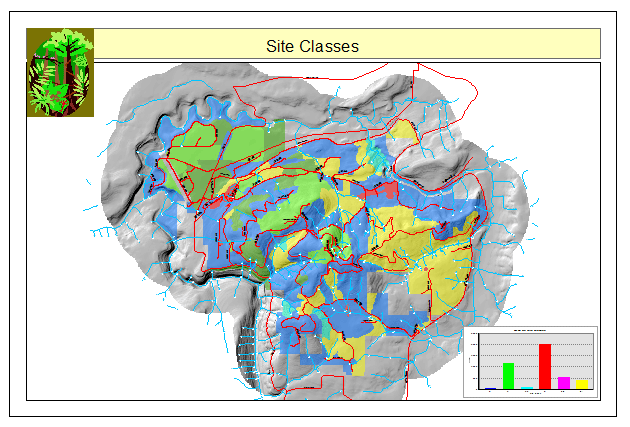
Now turn stands layer on, you will see that the stands with the lower site class are red and yellow, moderates are blue, and the highest values are green.
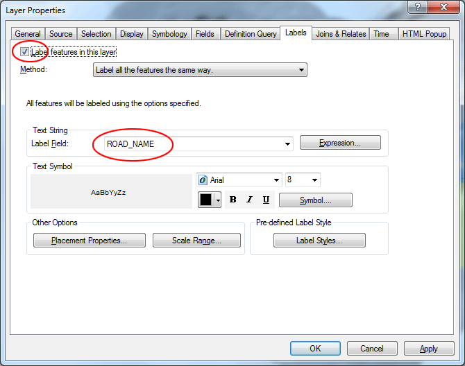
Let's add text labels for the roads layer.
Double-click roads layer. On the Labels tab in the Layer Properties for roads, check the box for Label features in this layer. Select ROAD_NAME for the Label Field. Click OK.
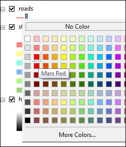
Turn the roads layer on, change the symbol color to red by right-clicking the layer in the Table of Contents, then pick the red color.
Create complex symbols for the streams layer, to indicate the Department of Natural Resources stream type. Open the properties for the streams layer. Double-click the layer.
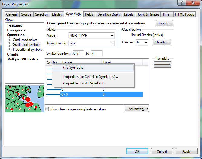
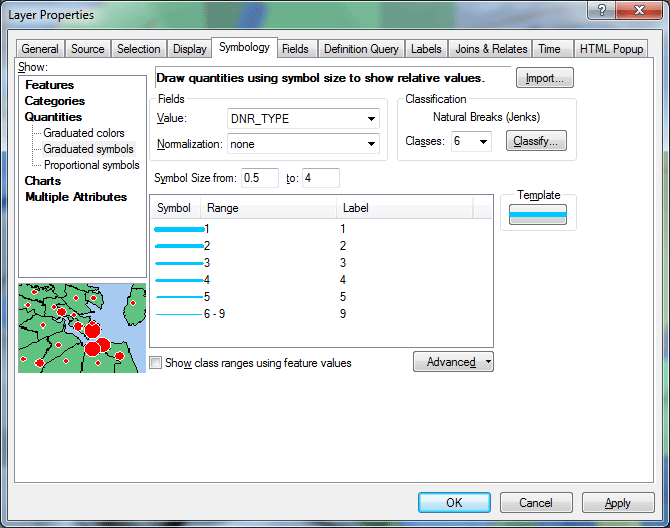
Start by changing to a graduated thickness symbol with 6 classes (go to Symbology tab, then Quantities > Graduated symbols, select DNR_TYPE as the Value field, and set the number of classes under Classification to 6).
Change the Label for the 6th symbol from the default value of 6-9 to 9 (there are 6 values for DNR type: 1, 2, 3, 4, 5, and 9).
Click the Symbol field heading and select Flip Symbols so the thickest line represents value 1 (DNR type 1 is "most significant").
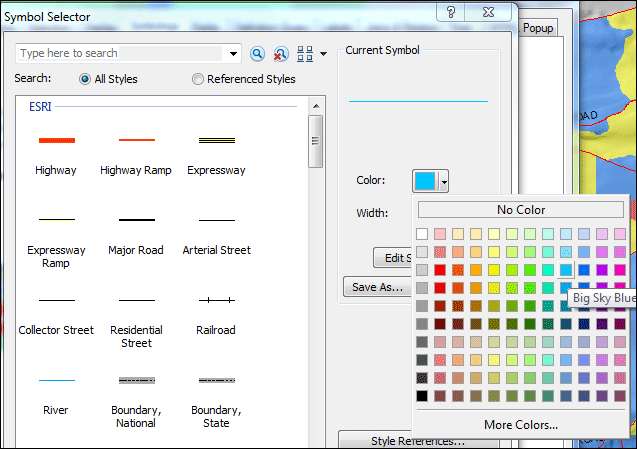
Change the properties for all symbols (click column heading Symbol > Properties for All Symbols) to a lighter blue. Click OK in the Symbol Selector, then in the Layer Properties.
You will be creating a line symbol composed of two layers, one simple line layer, and another layer with the DNR type number.
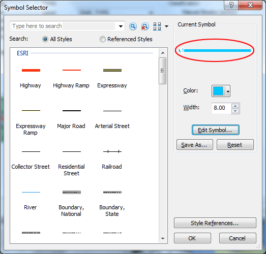
Double-click on the symbol for class 1, and then click the Edit Symbol... button in the Symbol Selector dialog.
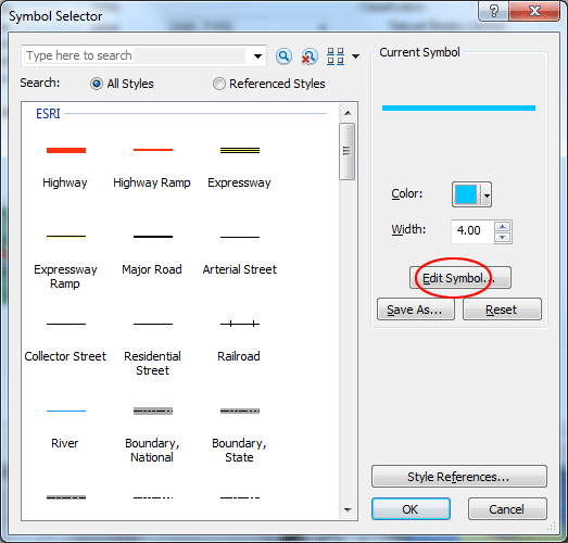
Change its width to 4 points (if it's not already set to that). Click the + button to add another line layer. You can see a new layer is added to the lasyers list.
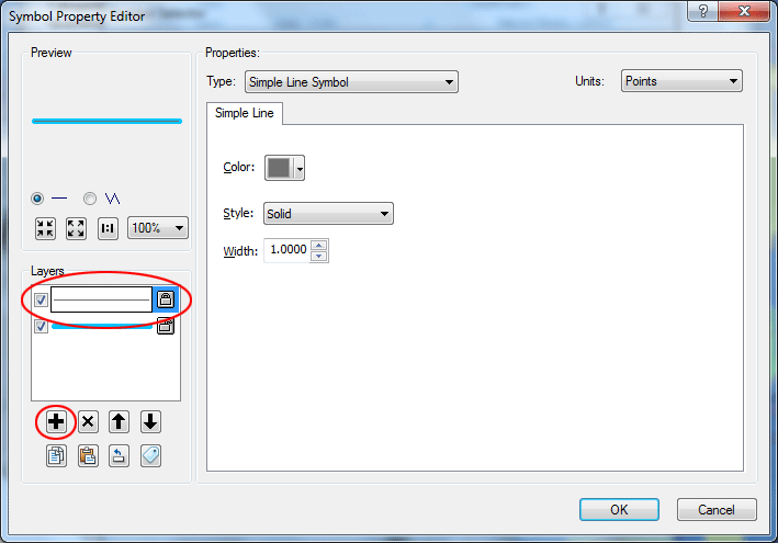
With the new layer selected, change the Type from Simple Line Symbol to Marker Line Symbol. Marker lines can be constructed with font symbols.
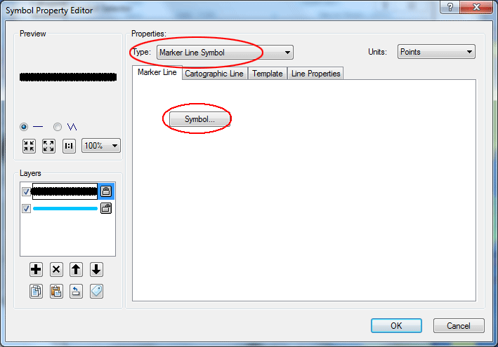
Click the Symbol button. In the Symbol Selector dialog click Edit Symbol... to alter the marker symbol for the marker line.
Change the Type from Simple Marker Symbol to Character Marker Symbol.
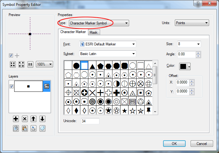
Change from the ESRI Default Marker to Arial font.
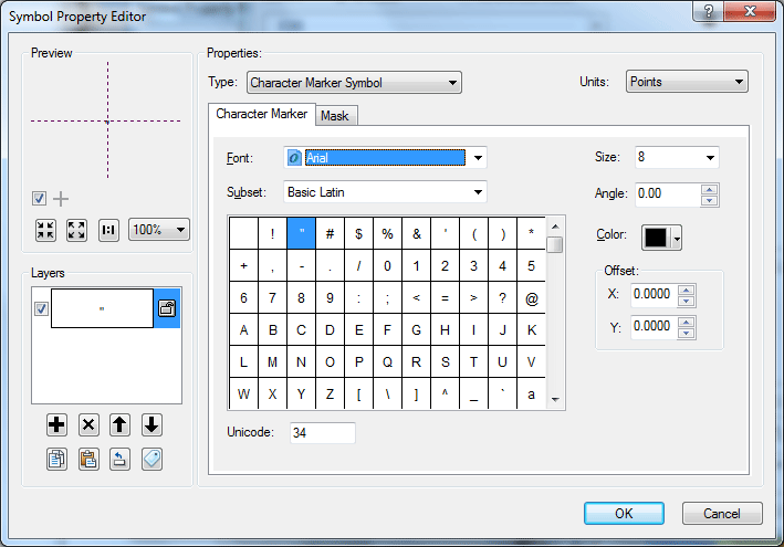
Select the numeral 1 for the symbol.
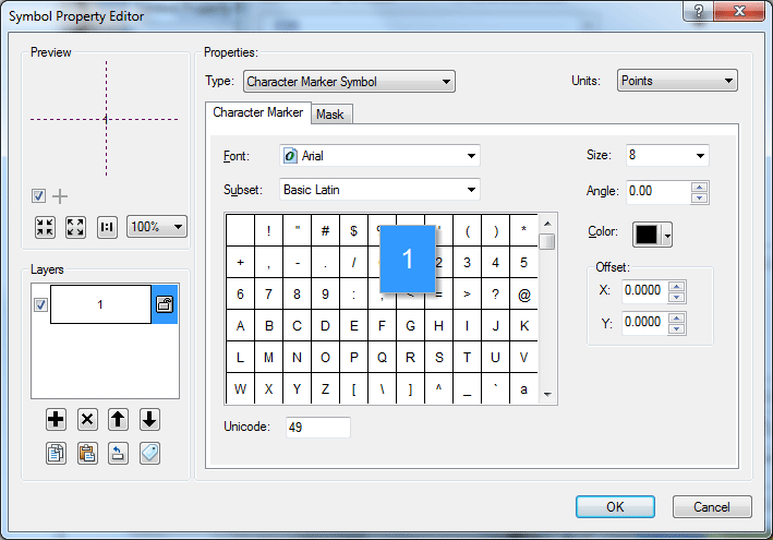
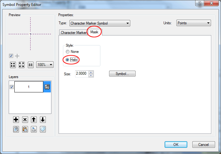
Click the Mask tab, and specify a Halo of 2 points. This will mask out underlying graphics. Click OK in the Symbol Property editor.
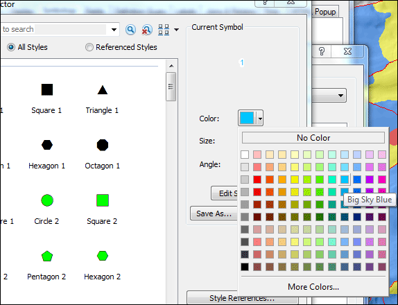
Alter the color of the symbol to match the line color. Click OK in the Symbol Selector window.
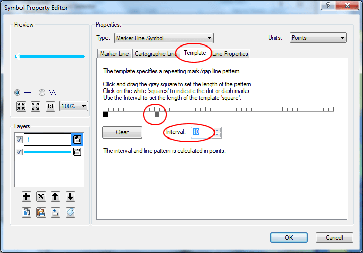
Back in Symbol Properties Editor Click the Template tab to alter the interval. Change the Interval to 10 points.
Drag the gray square in the marked scale to the 11th position. With an interval of 10 points, this will separate markers by 100 points (there are 72 points per inch, so the separation will be about 1.4 in.). Click OK.
Now you will see the way the final symbol will appear. Click OK in the Symbol Selector.
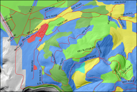
If you look at the area near the top of the map content (where Mashel River at the north of Pack Forest is located) you will see how the symbol has changed.
Repeat this process to change the other symbols accordingly.
Create a summary table from an attribute table.
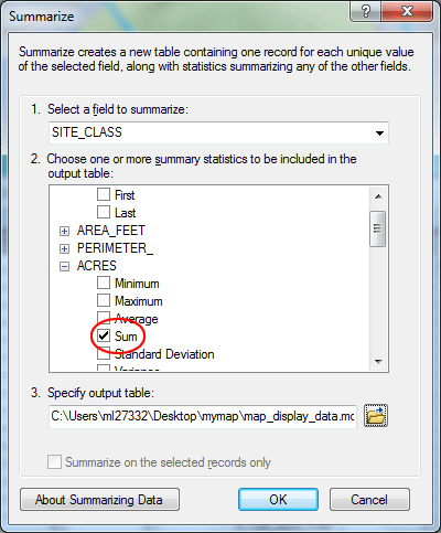
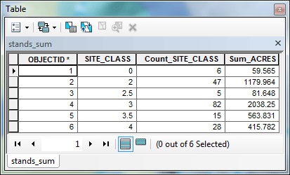
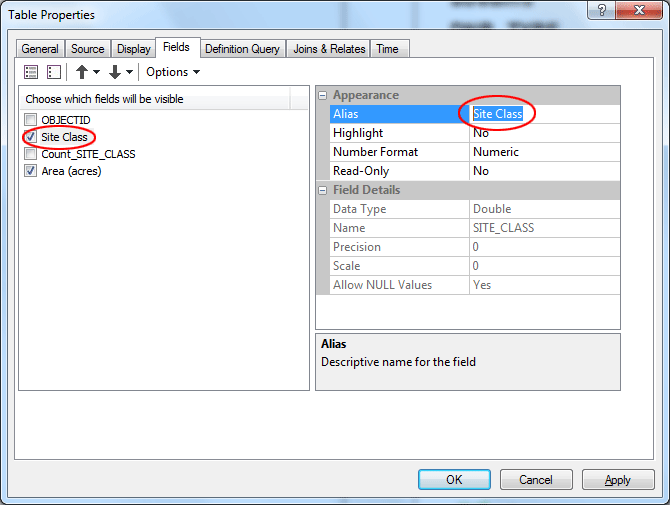
Open the attribute table for stands. Create a summary table for the SITE_CLASS . Right-click on the SITE_CLASS column label and select Summarize.
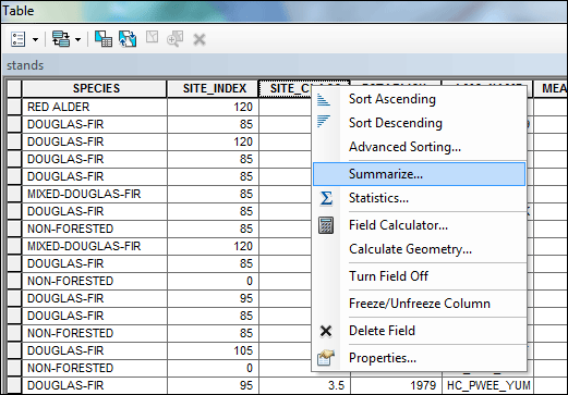
In the dialog, set the summary statistic to ACRES > Sum. Name the output table stands_sum. Be sure to save it in the geodatabase. Add the table to your map when asked.
Open the new table and check its contents. We now know the total area (Acres) for each of the site classes.
Create a graph
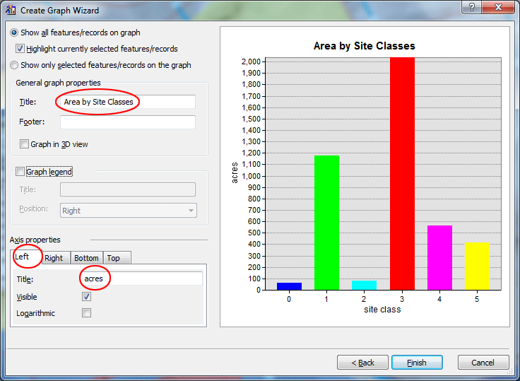
Create a graph from the summary table stands_sum. Go to View > Graphs > Create. Adjust the graph elements and properties so that the graph is formatted the way you want it. Refer to the previous tutorial if you need to review graph making.
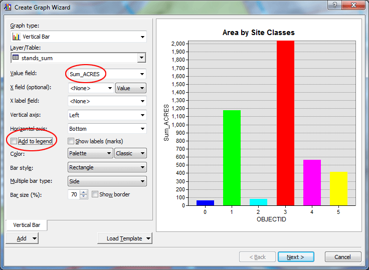
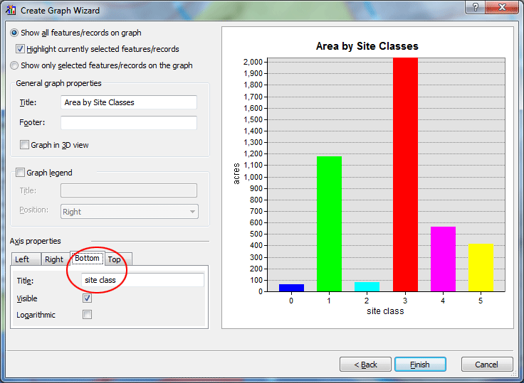
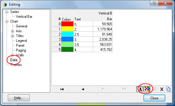
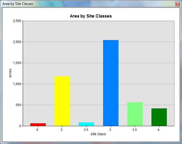
Change the colors of the data markers to match the symbology for the stands. To do this, right-click on the graph and select Advanced Properties > Data. Double-click on the color for each site class and then select its new color to match that you used in the layer symbols.
Create a map layout
In order to see layout view, click the Layout view icon  below the lower left of the map display. below the lower left of the map display.
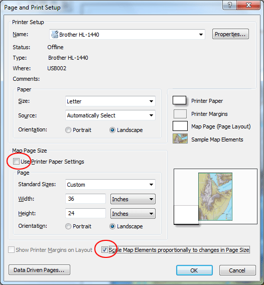
Change the page properties by selecting File > Page and Print Setup. Set both the paper and page orientation to Landscape. Uncheck Use Printer Paper Settings. Change the size to a larger poster size (Width = 36 in; Height = 24 in). Click the checkbox for Scale Map Elements... to have the elements resize.\
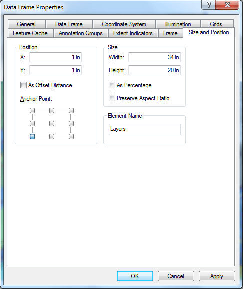
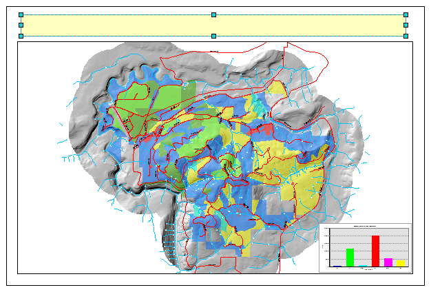
Right-click on the data frame in the layout view (that is, the selected map area in the figure above) and select Properties.
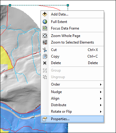
On the Size and Position tab: Set the Anchor Point at (1, 1). Change the Size to 34 x 20. Click OK.
Note: although it is possible to change the size and position of map elements manually with the selection handles and the pointer tool, if you set size and positions of elements using coordinate values, it is much easier to get elements to line up.
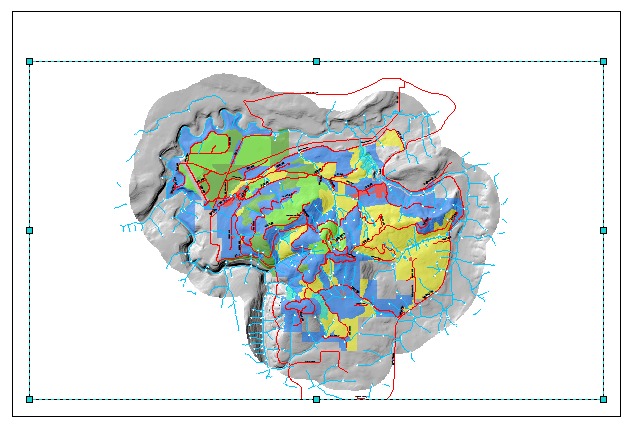
Work with the zoom and pan tools until the map is in the position you like.
Add elements to the layout
Adding Graph
If you have closed the graph, open it again. Go to View > Graphs, then click the title of the graph. Right-click the graph and select Add to Layout. Close the graph again.
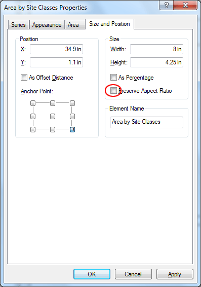
Right-click the graph and select Properties then click Size and Position tab. Position the graph on the layout as shown below. This will offset the graph by 0.1 in from the map border. Note how the Anchor Point is used to position the graph in the lower right corner. When you're done, click OK.
Adding Text
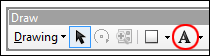
Go to Customize > Toolbars, then check Draw to turn the Draw toolbar on.
Add a rectangle at the top of the map. It will be used to hold the title text. In the Draw toolbar, click the Rectangle tool, then make a rectangle on top of the map frame.
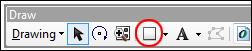
Right-click the rectangle, change its properties as below. This will give a 0.25 in gap between the text box and the map border.
Add a text element by clicking New Text tool in the Draw toolbar. Click anywhere inside the rectangle to place the text frame.
Double-click on the text element and set its Properties:
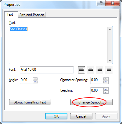
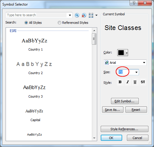
Click Change Symbol and specify a font size of 72 points (1 in).
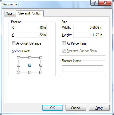
Click on the Size and Position tab and change the position so it is about in the middle of the rectangle. Click OK.
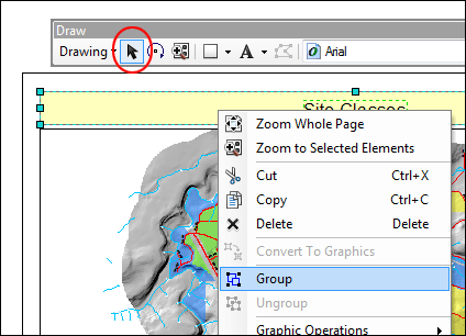
Select both the rectangle and the text using the Select Elements tool, press Ctrl key the same time selecting the element. and then right-click > Group.
Adding Graphic
Save to your local directory the logo below (right-click on the image and use the menu choice to save the image):
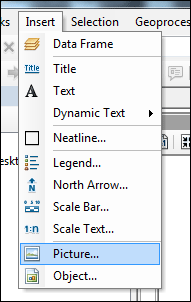
Select Insert > Picture. Navigate to your directory and you find the graphics file.
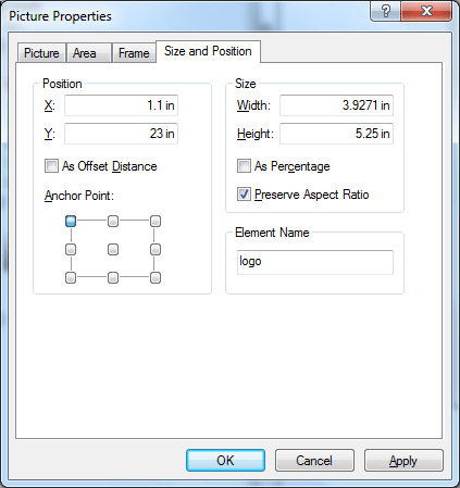
Change the position to place the image to the left corner of the title box. Right-click the image then select Properties. Note that Preserving Aspect Ratio will keep the image with the same proportions.
Adding Legend
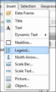
Add a legend by using the Insert > Legend menu choice.
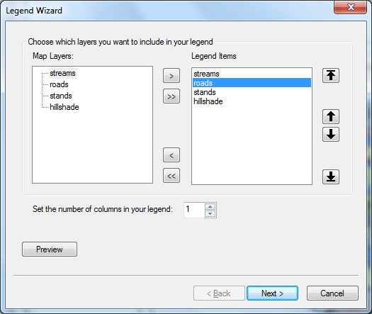
In the Legend Wizard, Select the layers to include by clicking the Add button  . You can also remove layers by clicking the Remove button . You can also remove layers by clicking the Remove button  . Order in the legend can be altered by using the Up . Order in the legend can be altered by using the Up  or Down or Down  buttons. buttons.
Click Preview to have the legend added to the layout. Keep clicking Next until you see the Finish button, then click Finish.
Note the names of the layers appear on the legend exactly as shown in the Table of Contents. If you alter the Table of Contents and the layer properties the changes will automatically be updated in the legend.
Change the names of the layers to make them more readable:
Right-click the legend and select Properties.
Uncheck Show for the legend title
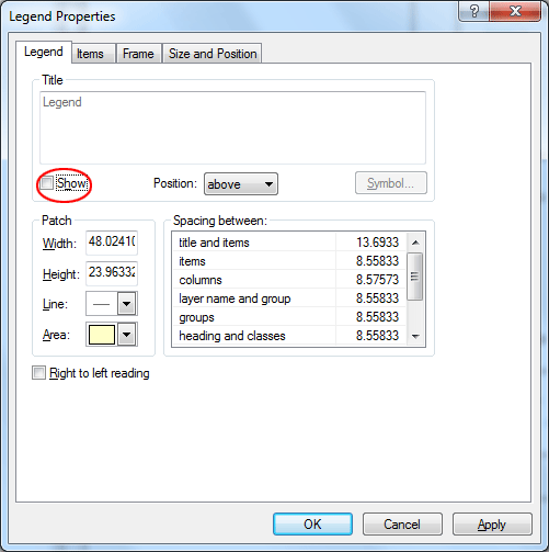
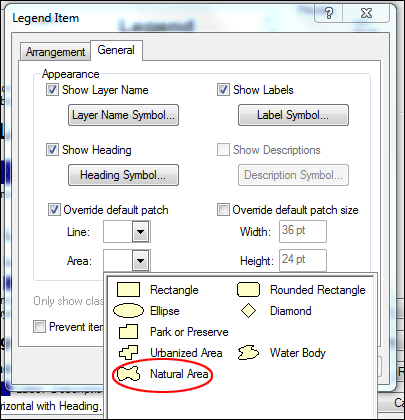
Click the Items tab. Remove hillshade from the list. Select stands and click Style. Then click Properties.
On the General tab, check the box next to Override default patch and click the pick list for Area under this option to select a symbol to override the default rectangle legend patch. Select Natural Area. This has a shape more like a forest stand polygon.
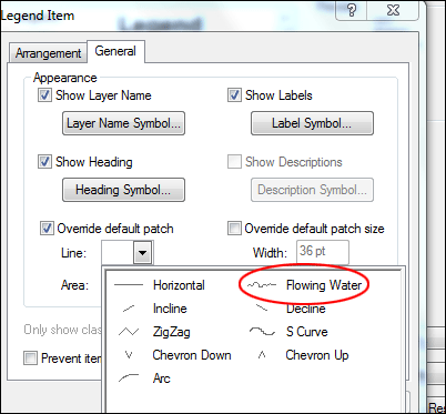
Click OK until you return to the Items tab. Change the Style for Streams.
Click Properties, again check the Override default patch option and alter the Line symbol to Flowing Water. Click OK until you return to the Item tab.
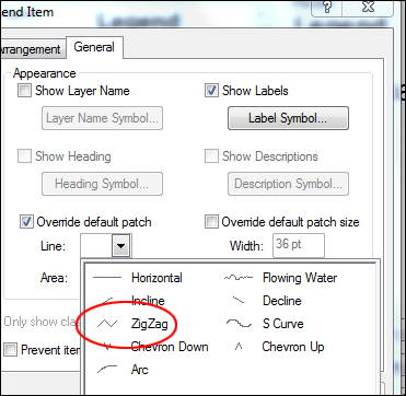
Alter the Properties for the Roads symbol to a ZigZag.
Change the position of the legend. After this, click OK. Inspect the legend.
Adding Table
Click the List by Source tab in the Table of Contents.
Double-click the stands_sum summary table to open its properties.
Click on the Fields tab. Uncheck the fields OBJECTID and Count_SITE_CLASS. Change the aliases for the fields SITE_CLASS and Sum_ACRES as below.
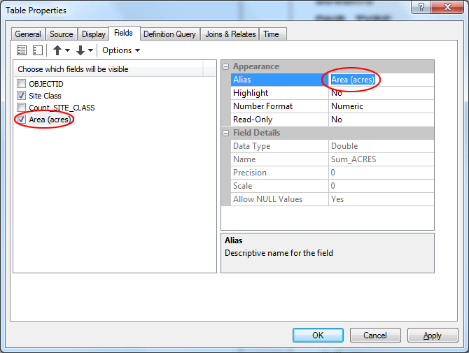
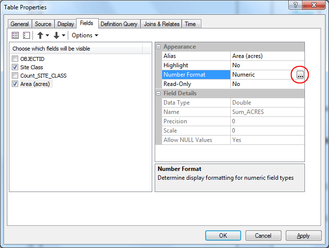
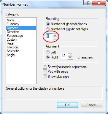
Click the ellipsis (...) button for the Number Format for the Sum_ACRES (now Area (acres)) field. Change the Number of decimal places to 1. Click OK.
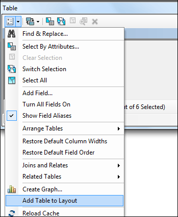
Click OK again, and then open the table. Click Options > Add Table to Layout.
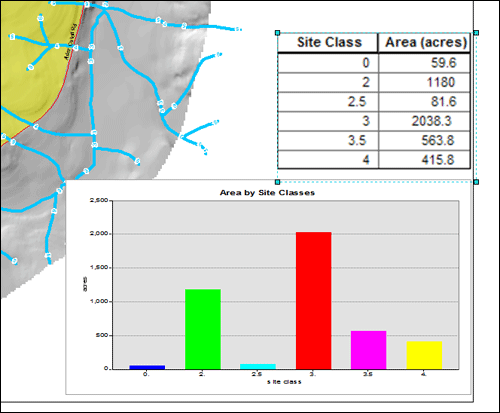
Now you should see the table is placed in the layout. (Note that it will probably appear in the middle of the map and be somewhat difficult to see -- look for the highlighted box.) Reposition and resize the table as you like.
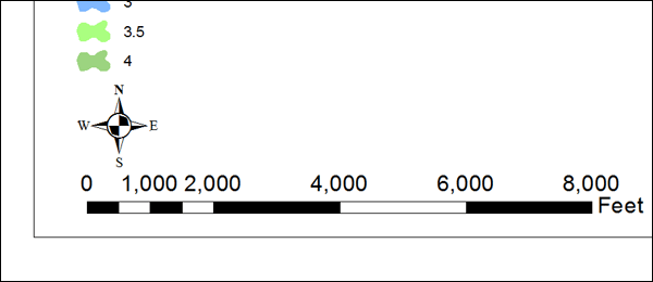
Adding Scale Bar and North Arrow
You can also add a scale bar and a north arrow in your map layout.
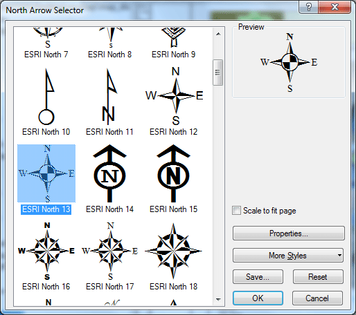
To add a north arrow to the layout. Select Insert > North Arrow.
Select the style you want and click OK. Reposition and resize the north arrow as you like.
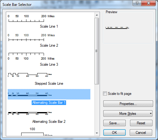
To add a scale bar. Select Insert > Scale Bar. Select the Alternating Scale Bar 1 and then click OK. Reposition and resize the scale bar as you like.
Export Map
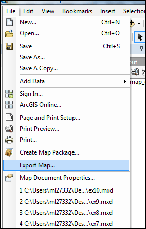
Let's create a PDF file that you could print later if you wish.
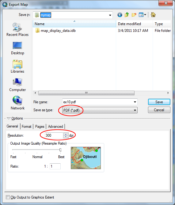
From the File menu, select Export Map.
Select the file type PDF with a resolution of 300 dots per inch.
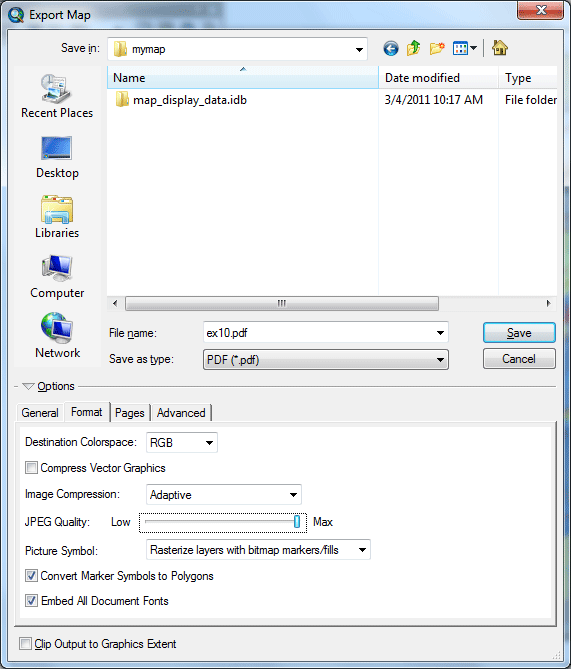
Change the Format to disable Compress Vector Graphics (to give the best quality) and to Embed All Document Fonts. When fonts are embedded, the document should be able to open properly on computers that do not have any of the special ESRI fonts (e.g., north arrow) installed. Also check Convert Marker Symbols to Polygons, which will allow symbols to appear on other computers that do not have document fonts installed. Slide the bar to Max for JPEG Quality.
Click Save. It may take some time for the PDF to be rendered if you are not on a fast machine.
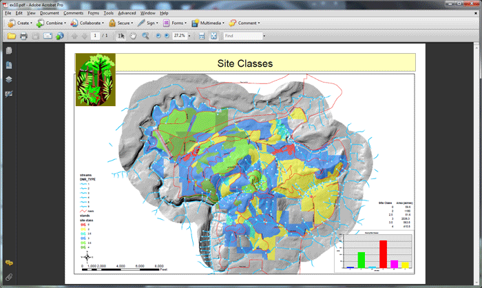
After the PDF is created, open it in Adobe Acrobat.
The deliverable:
No assignment.
prepared by Ming-Chun Lee, 10/02/2014
|