| |
ARCH4050 / ARCH6050 / MUDD6050
GIS / Urban Mapping
Tutorial 2 - Linking External Data & Vector/Raster Conversion
PART A. SETTING UP THE PROJECT
- Download the following three datasets by clicking HERE and put them into your working directory in My Documents (remember
to unzip and extract them using Windows Explorer):
- Extent of Water Bodies and Land (sndshore)
- Metro Transit Revenue Service Routes (tpipath_rev_cur)
- Metro Transit Route Timepoints (timepoint)
- Open ArcMap and add all of the above datasets to a new project.
- Adjust the symbologies for easy viewing. Here are some suggestions:
- For the tpipath_rev_cur dataset, change the symbology to
a thin black line;
- For the sndshore dataset,
set the symbology using Categories: Unique Values,
using the field feature. This setting will display
each sndshore feature differently depending on what
its feature value is. To see a list of all of the
distinct feature values, click on the Add All Values button. For the feature "waterbody", set the symbology to
"Lake" (by double-clicking on the current symbol next to
"waterbody"). Lastly, remove the symbologies for "land"
and "mudholes" (by right-clicking on each one, in turn, and clicking
the Remove Value(s) button) and uncheck the box next to "<all
other values>".
PART B. LINKING EXTERNAL DATA
You are now going to import a non-spatial data table into ArcMap. The
table is a xls format file (MS Excel) with two columns. The first column lists
the time-point key for all of the transit route time points in the Metro
bus system. The second column lists the number of routes that use that
time point. We are going to use this as an indicator of the level of transit
coverage in different areas of the City of Seattle.
Note: I generated this table by a very simple process in SPSS of taking
the Metro transit pattern table (available in the Transportation subheading
of the King County part of WAGDA) and aggregating it by time-point key,
recording the number of rows that have each value of time-point key.
- Download a table containing the number of bus routes passing each
time point by clicking here.
- Add it into your ArcMap project. (select tpfreq$ table)
- At the top of the Table of Contents, click on Source tab, you will then see the table you just added in,
- Open the table by right-clicking on its name in the Table of Contents
and selecting Open.
- To get some information on the frequencies listed in this table, right-click
on the heading FREQUENC and click on Statistics.
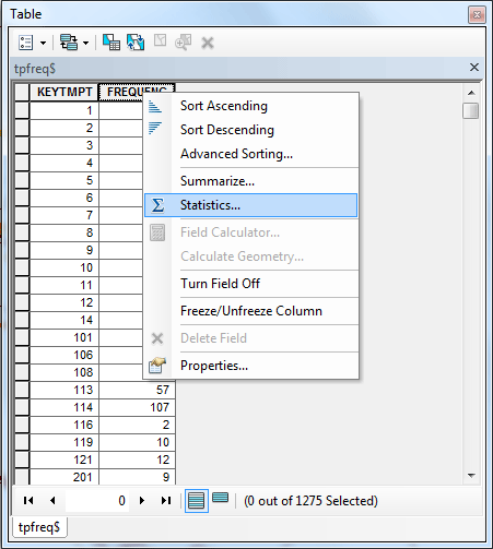
How many different time points are represented in the table? What are
the minimum and maximum values in the field FREQUENC? Write these down so you can include them in your
write-up.
When you're done, click on the X-shaped close box in the upper right corner of the dialog box, then click on the close
box for the table itself.
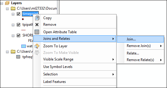
- Now you will join this non-spatial table with a spatial dataset, the timepoint dataset, using the unique identifier for the
time point as the linking variable. In the Table of Contents, right-click
on the name of the timepoint dataset and select Joins
and Relates > Join....
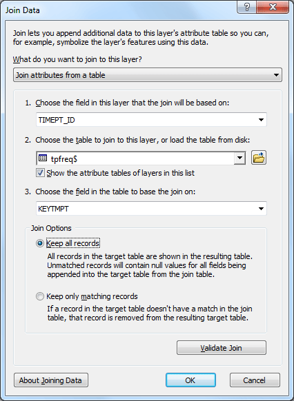
- In the box that appears, change the following settings:
- Set the drop-down box under "1." to TIMEPT_ID.
- Set the drop-down box under "2." to tpfreq$.
- Set the drop-down box under "3." to KEYTMPT.
- Click the OK button.
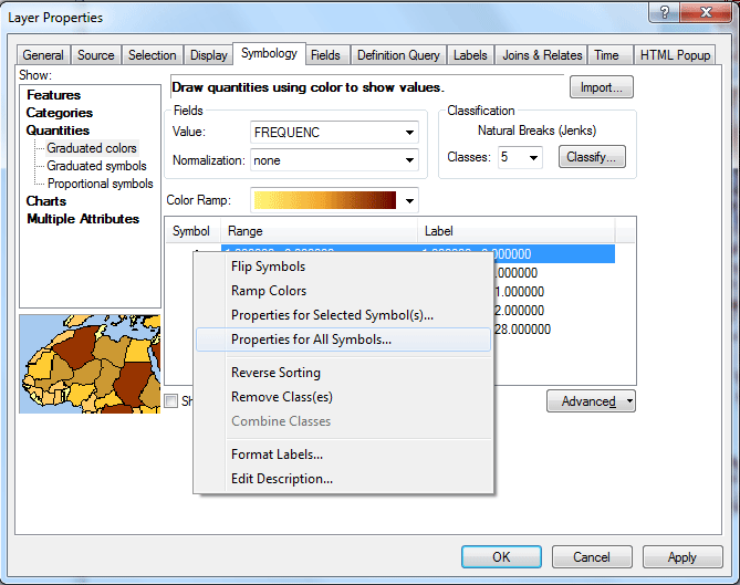
- Now change the symbology for the timepoint dataset using the newly
attached data. Right-click on the name timepoint in the
Table of Contents and select Properties....
- Under the Symbology tab, change the type of sumbology
to Quantities > Graduated colors. Click on the drop-down
box next to Value. In the
drop-down box, find and select "FREQUENC". Right-click
on one of the symbols and select Properties for All Symbols.
In the Symbol Selector dialog box, click on the Edit Symbol... button and uncheck the checkbox next to Use Outline.
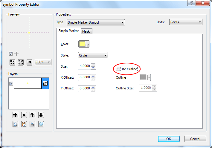
Click OK twice to get back to the Layer Properties.
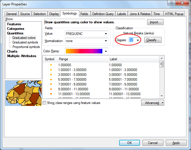
Last, change the number of Classes to "32"
and click OK.
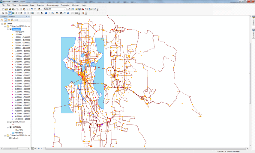
- Your map will look like this:
PART C. GENERATING A RASTER LAYER FROM POINT DATA
In this step, you will use the Time Points dataset to estimate a surface
that represents an abstract quantity we'll call "Transit Route Accessibility".
For short, let's call that abstract quantity "TRA". You will
do this by creating a raster layer that estimates the TRA value at every grid location, even when there is no Time Point at that location. The
procedure you will use does this by interpolating between Time Points
in the vicinity of each grid location on the raster dataset.
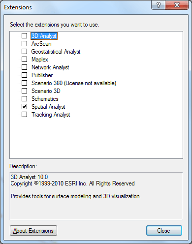
- First, make sure that Spatial Analyst is activated. You can go to Customize menu then select Extensions.., make sure the box next to Spatial Analyst is checked.
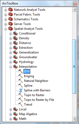
- Open ArcToolbox by clicking on the icon under the menu.

- In the ArcToolbox, click on the small "plus" (+) in front of Spatial Analyst Tools, then Interpolate, and double-click the
item IDW (which stands for Inverse Distance Weighted).
- In the dialog box that appears, set the following:
- Set Input Points to timepoint,
- Set Z value field to tpfreq$.FREQUENC,
- name your Output raster by clicking on the
open folder button, navigating to your personal directory, and giving the new raster dataset a name, such as "TRA".
- Set the Output cell size to 200
- Set Power to 2,
- Set Search radius type to variable,
- Set Number of points to 4 (and
leave blank the Maximum Distance),
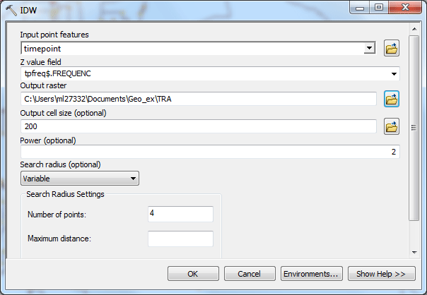
- Click OK to start the operation. This may take a
minute to complete.
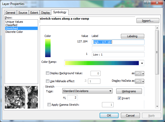
- The new raster dataset will automatically be inserted into your working
project. Double-click on its name to edit the symbology.
- Under the Symbology tab, change the Show type to Stretched.
- Change the color ramp to one of your liking. I'd suggest the one that
has yellow on the left and blue on the right, then clicking on the Invert checkbox to reverse the direction of the color ramp. When you're done,
click OK.
- Now navigate around the map of Seattle and think about the information
that is shown here. Think about and answer the
following questions in your write-up:
- What areas of Seattle seem to have the greatest Transit Route
Accessibility?
PART D. CONVERTING A RASTER DATASET TO A VECTOR CONTOUR DATASET
In this part, you will create a vector dataset containing contour lines
generated from the raster dataset that you created in Part C.
- In the ArcToolbox, Go into the Spatial Analyst Tools again, this time
finding the submenu Surface Analysis and thec double-click the
item Contour....
- In the dialog that appears, set the following:
- Set Input surface to the name of your raster
dataset for Transit Route Accessibility (TRA),
- Set the Contour Interval to 10,
- Set the Base Contour to 0, and
- Set the Z Factor to 1.
Also name your Output features by clicking on the
open folder button, navigating to your personal directory, and giving the new feature dataset a name, such as "TRAcontour".
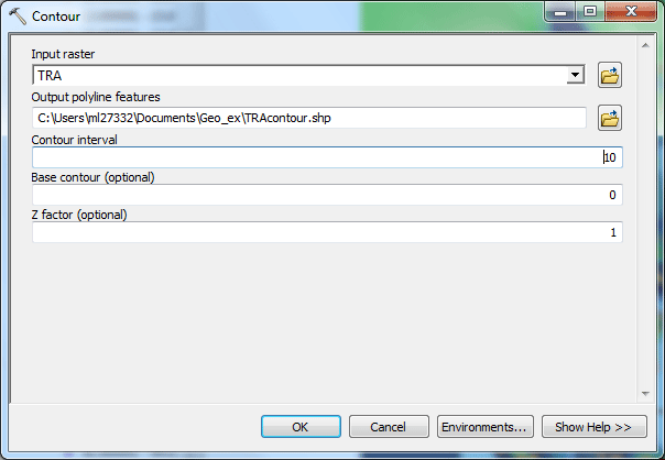
- Click OK to start the operation, which should be
completed in very little time.
- Now set the symbology for your new contour dataset by double-clicking
on its name in the Table of Contents.
- Under the Symbology tab, change the Show type to Quantities: Graduate colors.
- Under Fields, change the value to CONTOUR. Increase the Number of Classes to 11.
- Set the Color Ramp to one you like. I also suggest
increasing the widths of the contour lines by right-clicking on any
of the symbols and selecting Properties for All Symbols,
then increasing the Width to 3.
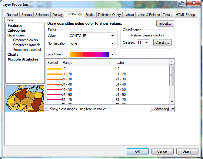
- Click OK to exit the contour dataset's properties.
- Now compare the data depicted by the contour map to the data depicted
by the raster layer. Think about and answer the
following questions in your write-up:
- How would you compare the results of the contour layer, in comparison
with the raster layer?
PART E. REPORTING YOUR FINDINGS
Create two JPEGs showing the City of Seattle, with one showing the raster layer of Transit Route Accessibility (from
Part C) and the other showing the contour layer (from Part D). Both maps
should also show the tpipath_rev_cur (transit routes) layer, the timepoint (time
points) layer, and the SNDSHORE layer to help provide geographical context.
You can add other layers as you like to help show the context, but stay
away from polygon layers, since it will be difficult to show both the
raster layer and a polygon layer at the same time.
Just to recap, your write-up should include the following, all in a Microsoft
Word file:
- A JPEG showing the raster layer of Transit Route Accessibility in
City of Seattle,
- A JPEG showing the contour layer in City of Seattle,
- Answers to the questions in Part B, Step 5,
- Answers to the questions in Part C, Step 9,
- Answers to the questions in Part D, Step 9.
Note: In terms of suggested length, I am only expecting
one or two sentences for each of the discussion questions.
The deliverable:
The assignment is due on Feb 16, 9:30am.
Turn it in to Moodle.
prepared by Ming-Chun Lee, 02/04/2015
|