Peer Reviewed: Grant Cawley
Website Review for 'Stuff Made by MMD'
Submission leads directly to the reviewed page.
There are no spaces or upper-cases in the file/folder names, including scripts, images, etc.
Design Evaluation
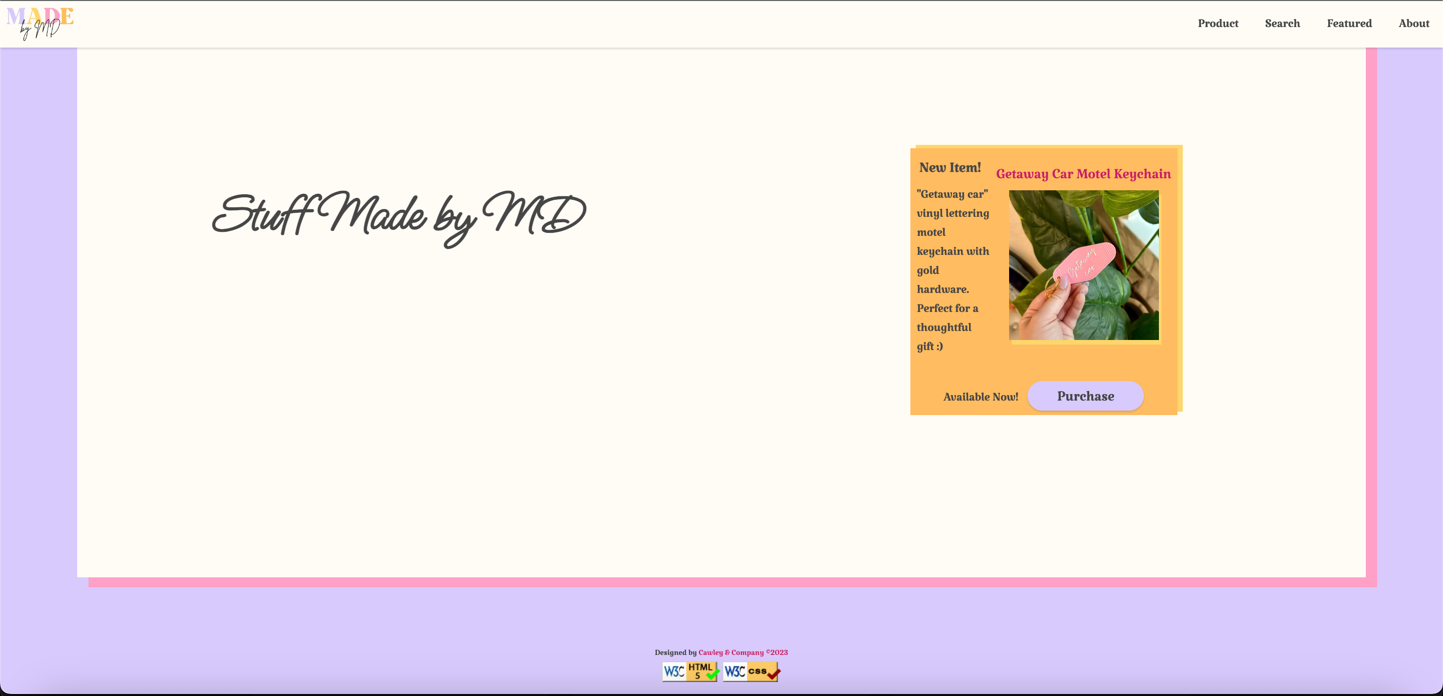
The webpage has sufficient contrast and font sizing, making it easy to read. The site follows a consistent color scheme with pastel colors and uses a standard font style, likely from a CSS file. The design principles of CRAP (Contrast, Repetition, Alignment, Proximity) are well applied:
- Contrast: There's a clear contrast between the background and the text.
- Repetition: The color scheme and fonts are consistently repeated to create a cohesive look.
- Alignment: Elements on the page are aligned, enhancing both readability and aesthetics.
- Proximity: Related items, such as product information, are grouped together appropriately.
Page Structure Analysis
- Header: Contains the site/brand name "Stuff Made by MMD" without including the page name, likely in an h1 tag.
- Main: Features a product prominently with a clear image and description, which could be under an h2 tag.
- Footer: Includes HTML and CSS validation buttons, indicating adherence to web standards.
Branding and Content
While the brand tagline is not explicitly visible, it's suggested to include something like "Handcrafted Delights by MMD" consistently across pages.
Footer Details
The footer's inclusion of validation links is noted, and whether it contains a user page menu is not clear from the image and may be part of the top navigation.
Website Review for 'Stuff Made by MMD'
Submission leads directly to the reviewed page.
There are no spaces or upper-cases in the file/folder names, including scripts, images, etc.
Design Evaluation
The webpage has sufficient contrast and font sizing, making it easy to read. The site follows a consistent color scheme with pastel colors and uses a standard font style, likely from a CSS file. The design principles of CRAP (Contrast, Repetition, Alignment, Proximity) are well applied:
- Contrast: There's a clear contrast between the background and the text.
- Repetition: The color scheme and fonts are consistently repeated to create a cohesive look.
- Alignment: Elements on the page are aligned, enhancing both readability and aesthetics.
- Proximity: Related items, such as product information, are grouped together appropriately.
Page Structure Analysis
- Header: Contains the site/brand name "Stuff Made by MMD" without including the page name, likely in an h1 tag.
- Main: Features a product prominently with a clear image and description, which could be under an h2 tag.
- Footer: Includes HTML and CSS validation buttons, indicating adherence to web standards.
Branding and Content
While the brand tagline is not explicitly visible, it's suggested to include something like "Handcrafted Delights by MMD" consistently across pages.
Footer Details
The footer's inclusion of validation links is noted, and whether it contains a user page menu is not clear from the image and may be part of the top navigation.