|
|||||||
|
|
|
Home |

|
February 19th: Planning For Your User DocumentsPlan of Attack Tonight we're going to do the following:
User-Centered Technology Ch. 5 I know we need to catch up a little, so let's head over to Johnson's User-Centered Technology webpage. User Document Ideas: Below are some important things to consider about user documents.
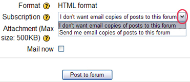
To avoid getting e-mails of all posts, make sure you select "I don't want email copies of posts to this forum" from the Subscription text box at the bottom of the page (before you hit reply).
Exercise: Working in groups, create a "paper" prototype for an information kiosk to assist visitors to your campus or office building or to a shopping mall or museum. The kiosk will be located in the lobby or central location (you define where). Visitors unfamiliar with the services or locations of departments would consult this kiosk to get a sense of where to go and how to get there. Consider the types of visitors you need to help and the types of information they will want. Create a profile of your primary visitors and tasks. Then, create the "interface," beginning with the main screen, from which the user can select other screens for information. When the task is complete, a representative from another group will become the target user for you kiosk to test the usability of your prototype. (Exercise comes from Barnum, 2002, p. 137)** Instead of using index cards or paper, use the Notepad and have separate text files (.txt) represent different cards--using word documents would be goofy, so use Notepad. This ought to have a rather interesting effect on the user. When you come to the part where you bring in another user, describe (meaning write this down on something) how the user adjusts the prototype (the "cards") you created. Make sure you ask the user to arrange the cards on the desktop as they would want them to appear on a kiosk interface--don't coach them. Therefore, you create the cards, but let the user arrange them. One of you should host the final prototype on his/her webpage, but each member should have a link to the prototype. Make screen captures or an entire screen capture of the layout the group decides. Those of you who are testing these designs, I want you to report back to class why you arranged the cards or adjusted the contents of the cards (adding or deleting) the way you did. In other words, what is your mental model of how that particular kiosk should be set up? Catch out the Virginia Tech Kiosk. Time permitting, I want to play a little memory game based on the short- and long-term memory but, if we're short on time tonight, we'll skip it. Let's look at the following webpages and analyze their features. If we assume that webpages are supposed to be for the user, then we can assume that a user-centered design would be best (we can critique that assumption, too). Let's consider ease of navigation to be a top priority for an effective webpage. What instruments would work well for our next assignment? Hmm...search engines were good for the first User Doc, but we need to move beyond obvious Internet-based functions. One thing's for sure, though, we're going to have a much larger meta-analysis persona documents and more analysis on user testing. Also, we're going to try and see my goal of "inspiring" the user through to fruition. Does anyone have any documents that advocate or encourage users to explore the functions/functionality of instruments? Although I've stressed and used computer-based examples overwhelmingly in our discussions, you are more than welcome to document other kinds of technology. Of course, we're going to do the usability testing in class, so your instrument would have to fit that constraint. However, I would consider out-of-class user testing if you documented it well. Remember, you need to build on your skills throughout the semester (and from the previous semester, year, or what have you), so I want to see some sophistication. Let me show you what a student did a couple years ago... Meta-Analysis Persona Doc for #2 We'll have more in-depth meta-analysis persona document this time around. Unfortunately, we aren't getting live subjects...er...participants from outside class, but I know all of you will work hard to help your fellow classmates by being as objective as possible. The first change, though, will be that I want you all to come up with three personas for the instrument you'll document. I also want you to include the following:
Have a rough draft of the above planning document (think of it as a memo if you'd like) to accompany your actual user document next week, which will be the steps the user will carry out to do something. Who has an idea of what they'd like to do? Before We Go... Your Midterm is next week. Make sure you've read, and the exam will be easy. Make sure you've reviewed the website, and it will be much easier. **Barnum, Carol M. (2002). Usability Testing and Research. New York: Longman.
.. |
||||||||||||||||||||||||||||||||||||||||||||
|
|
|||||||||||||||||||||||||||||||||||||||||||||
| © UNC Charlotte Copyright | Privacy Statement | Page Maintained By: Aaron A. Toscano |

